(Font is from http://typodermicfonts.com/foo/, used according to licensing agreement. Found on https://www.dafont.com/foo.font.)
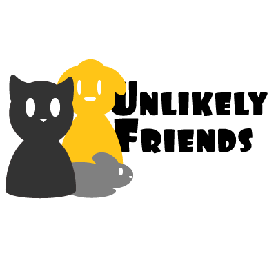
For this topic, I decided to make a logo for a fake Animal Shelter that takes in any kind of animals, along with cross socializing animals when able to be done safely. This fits in with my theme of animal rescue, and isn’t based off of any shelter that I currently know of.
I started off with making a couple small sketches of ideas, wanting to keep it simple without just copying the design ideas off of what we did the in tutorials. While I didn’t really use anything we didn’t already do in the tutorials, I didn’t want to something that was directly based off of what was done in them, thus I decided to draft a logo somewhat like the Petco logo, where it has multiple animals (in this case, a cat, a dog, and a rat) cuddled up together. I’m not a great artist, so I tried my best to make them out of ellipses. I tried to make each animal visually contrasting through different heights, to make sure they weren’t blending into each other by not having enough difference between them. Essentially, I made it as simple as possible and just wanted to make sure everything looked different enough that you could distinctly tell what you were looking at. However, I haven’t managed to finish the logo as I would have liked. I didn’t have the time to figure out how to make the tails, and thus had to leave them out now for now. I couldn’t get them to look how I wanted, ending up looking very odd. I still need to work on it.
Overall, the only thing that I used outside of my own creation is the text, which is already linked to at the top of the page. It is free to use in logos, so I was alright in my use of it. It does not say you have to give credit, but credit is below the image.

I really enjoyed the simplicity of your logo design. Even if you are feeling shaky on a few parts of the graphics, I think the overall look gets the point across. In my opinion, only the cat really needs the tail added if you decide to keep all the animals positioned close like you have them currently. I would also recommend moving the text a little bit more to the right to better read what it says. Try experimenting with the placement of the text, maybe make it smaller to allow the graphics to pop a little more. I might also try using different colors on the cat and mouse, making them appear more warmer and more inviting. In general, I like the look of the graphics you have created and am confident that the final version will look crisp. Best of luck.
LikeLike
I really like the whole concept behind your logo! I think it could look even better if you were to try to make some improvements on the animals you created. One suggestion I have for you is trying to follow a theme, such as figuring out whether you would like the animals to have a more realistic look to them or cartoonish, to bring them to life a little more. Certain ways you could do this is by adding more features to the animals like eyes, feet, a nose, or a mouth. Along with adding features you could add a little more color to them, for example a pink nose on the cat. I feel like adding these small details will really bring your logo together. Another suggestion I have for you is to maybe move the text away from behind the dog so it’s not covered. I feel like the title is an important part of the logo so adding the distance away from the animals will add a little more emphasis on it. Overall I really like where you’re going with your logo and think that the fact that you placed the animals close together creates a sense of belonging and friendliness among them which goes well with the theme of your logo.
-Shanya
LikeLike
Hi Daniel! I love your design and it looks very professional, that is awesome! I think that the color scheme works really well and that the font really brings everything together. The animals and the overall shape of the logo has a really fun and bubbly feel to it. I think that adds a really positive touch to something that can be sad such as an animal shelter.
One thing that I would look back on revising is adding tails to the animals. I know that you mentioned that you were having difficulties achieving this, but I think that it would really top off the final image.
One last suggestion that I would give you is to maybe make the cat and mouse flush on the bottom of the image. I think that it would help to create an overall complete look.
Overall, I think this is an awesome start and look forward to seeing your final project!
LikeLike
Tail or no tail, I think you have the best logo of the group! I am not sure if you are very comfortable with illustrator or not but it really seems like you did know what you were doing (can’t say the same for myself honestly). The colors of each of the animals contrast, while still blending in to the entirety of the logo. I think that I agree with what the others have said about the tail. I would also agree with the others comments about the closeness of the animals. One last thing I would have to say about the design is the words being a little more separated to the opposite side of the furry friends. Other than that you have about 90% of the work done on an otherwise successful logo. Great work Daniel!
LikeLike