(Font is from http://typodermicfonts.com/foo/, used according to licensing agreement. Found on https://www.dafont.com/foo.font.)
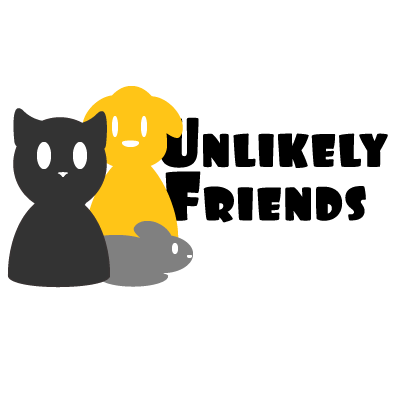
For this topic, I decided to make a logo for a fake Animal Shelter that takes in any kind of animals, along with cross socializing animals when able to be done safely. This selection was to make it fit in well with my theme while still being different enough from other animal shelters that I know of the existence of.
I started off with making a couple small sketches of ideas, wanting to keep it simple without just copying the design ideas off of what we did the in tutorials. While I didn’t really use anything we didn’t already do in the tutorials, I didn’t want to something that was directly based off of what was done in them, thus I decided to draft a logo somewhat like the Petco logo, where it has multiple animals (in this case, a cat, a dog, and a rat) cuddled up together. I’m not a great artist, so I tried my best to make them out of ellipses. I tried to make each animal visually contrasting through different heights, to make sure they weren’t blending into each other by not having enough difference between them. Essentially, I made it as simple as possible and just wanted to make sure everything looked different enough that you could distinctly tell what you were looking at.
In my draft I hadn’t added their tails, and originally had the text slightly behind the animals, not enough to make it in any way unreadable, but people seemed to not like it that way, which lead to me moving it out more to the side. Beyond that, not much has changed between the draft and the final, other than the addition of tails and a slight shift in the cat’s position. I didn’t end up changing their color like was also suggested, as I ended up not really liking any other color scheme than the one I had already picked.
Overall, I think my logo, like my graphic design project, didn’t need that much changed. I liked the text already, and didn’t need to do anything. I had no problems with the program, and managed to finish with no problems.